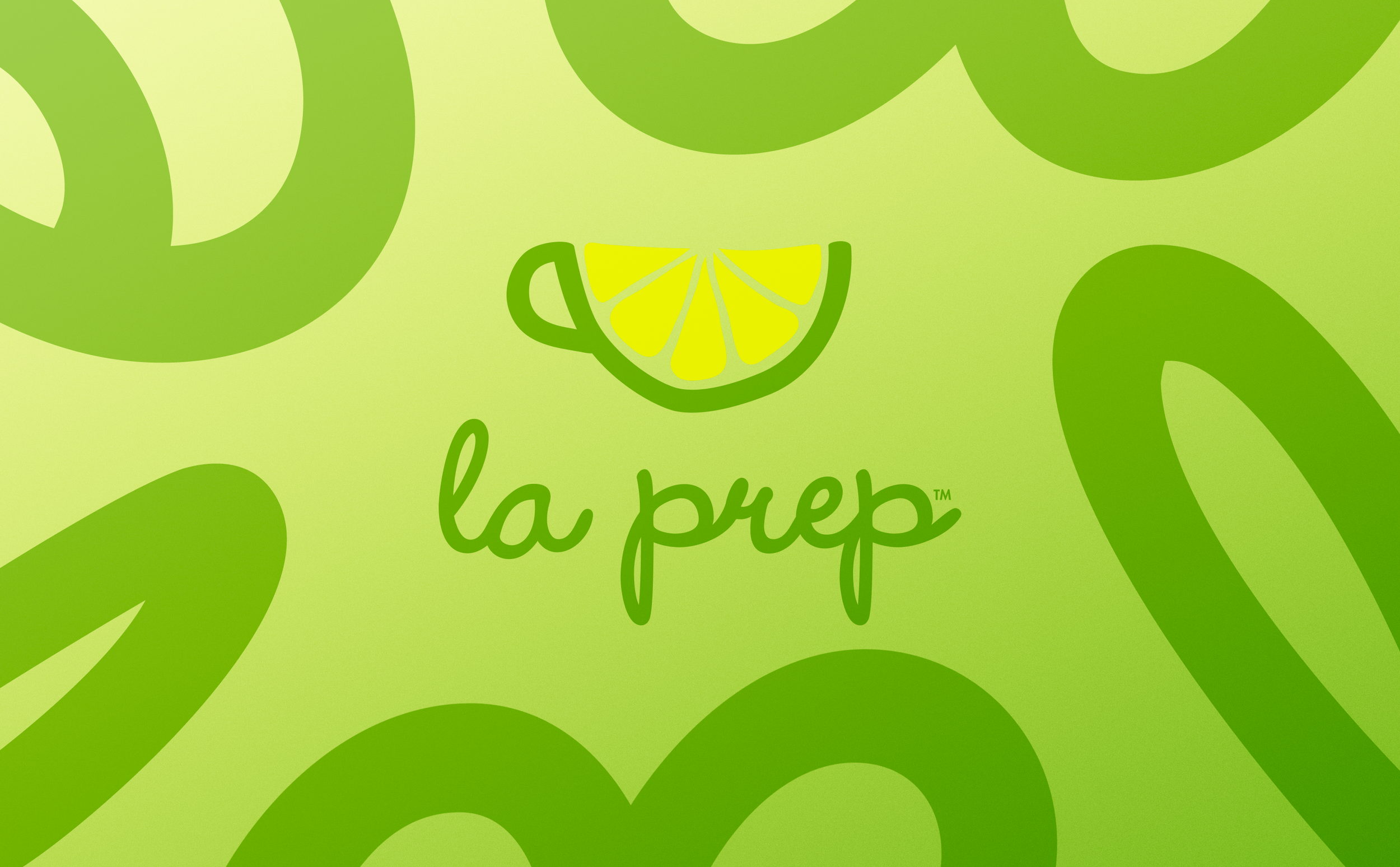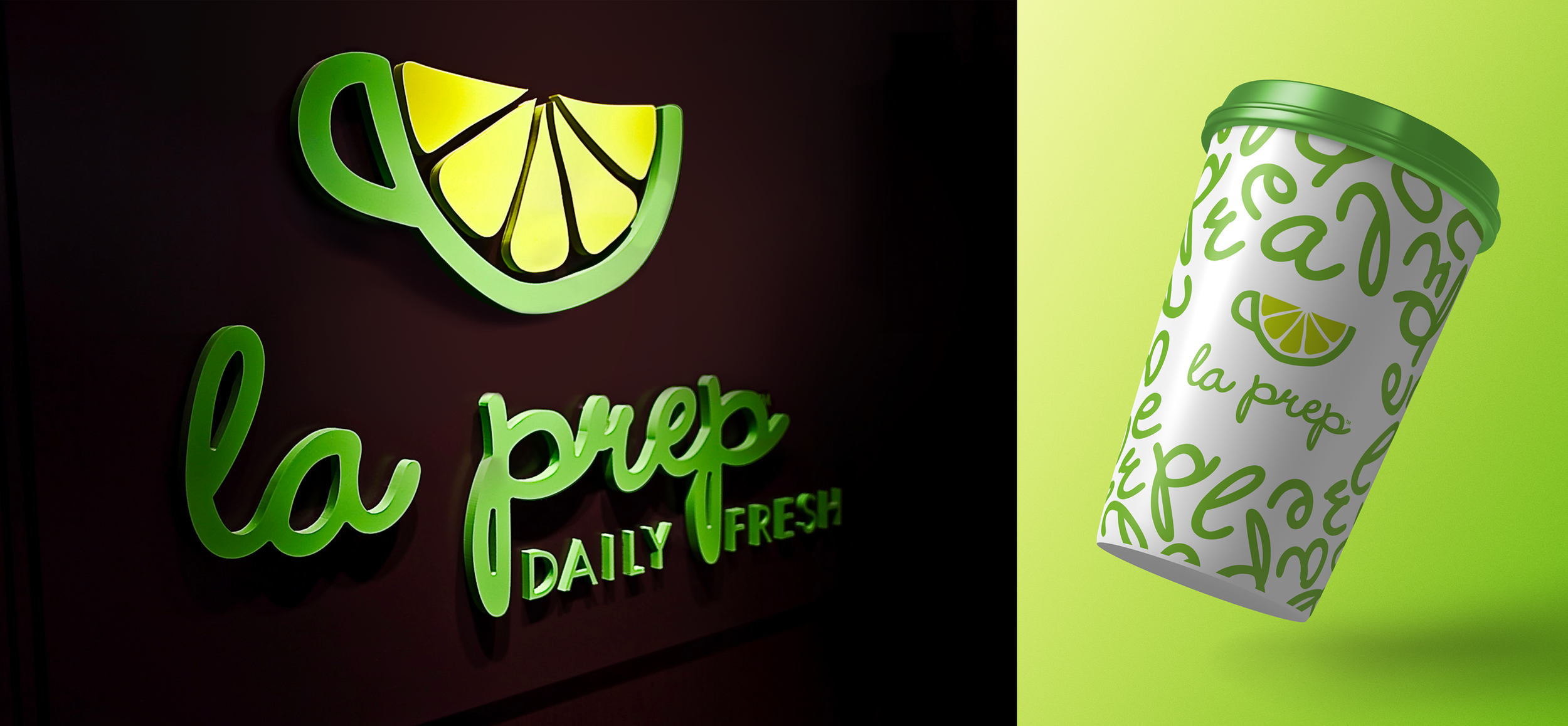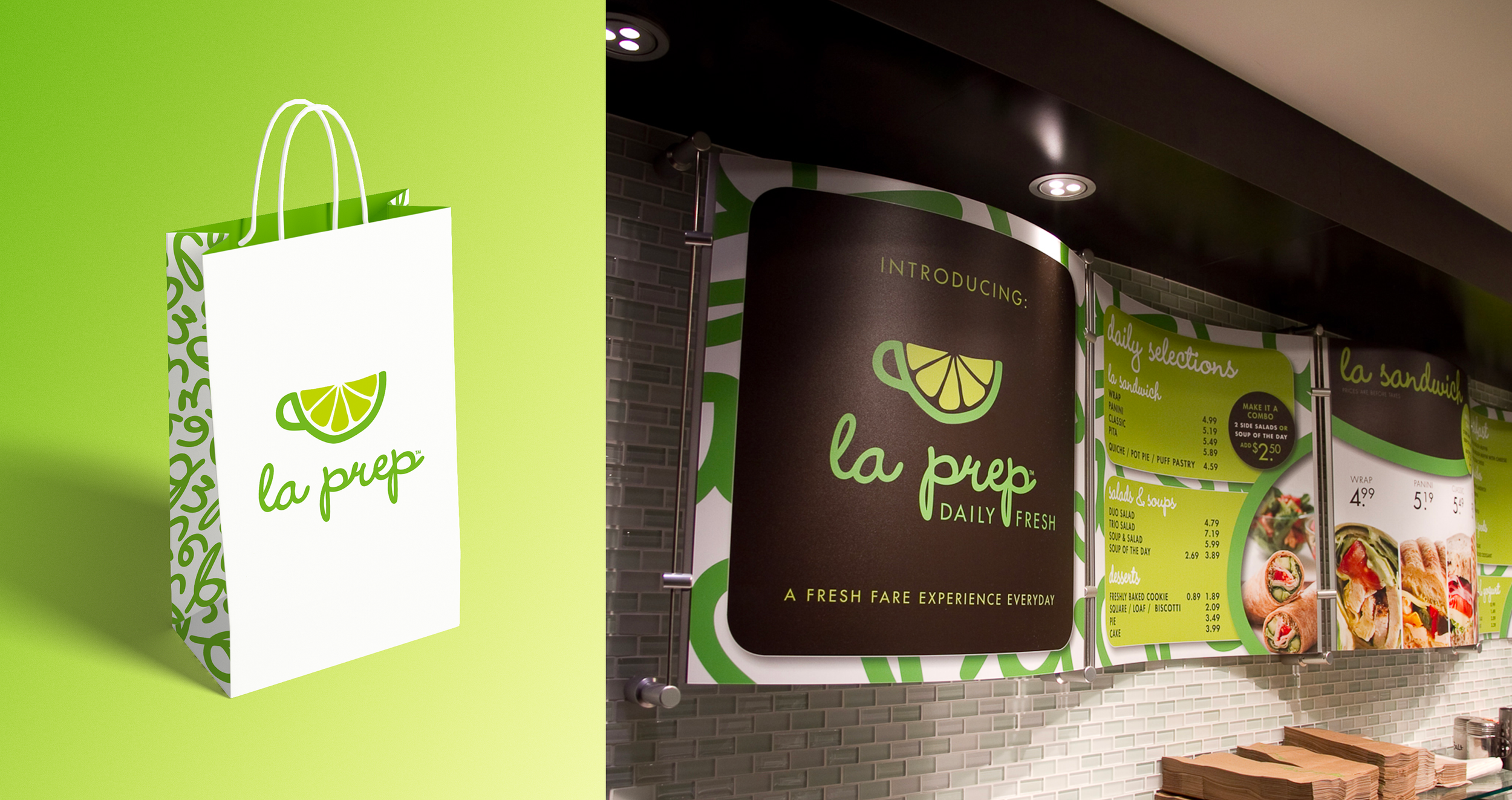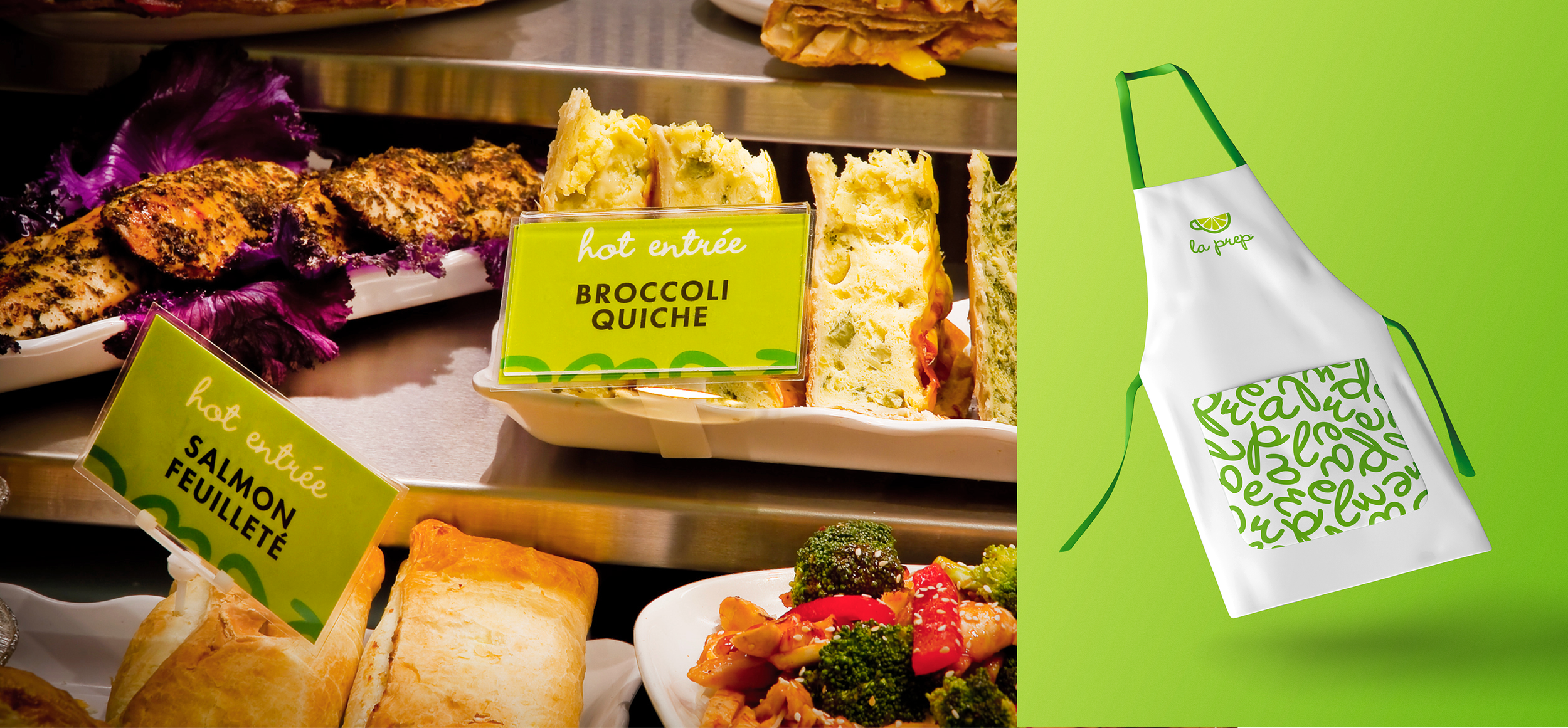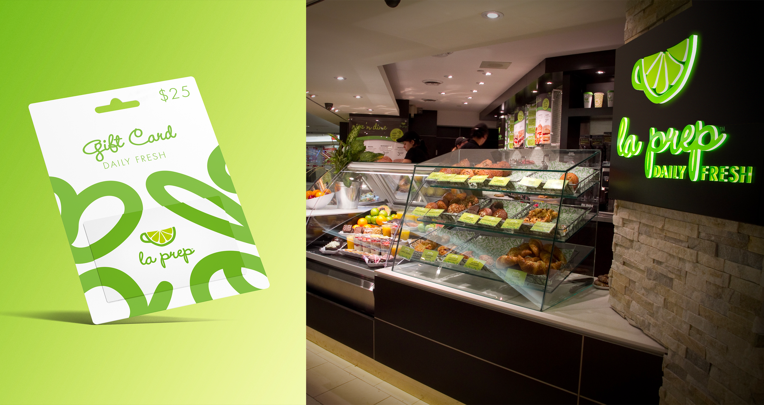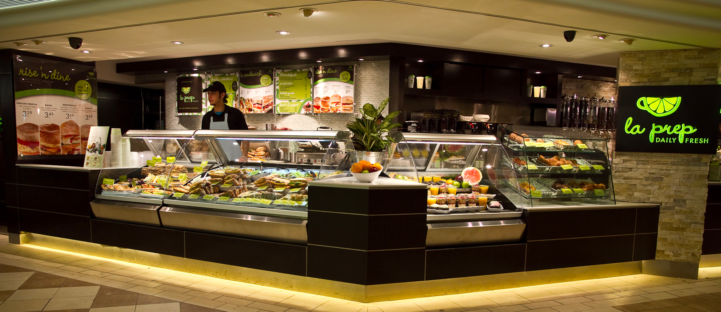


This chain eatery required a brand refresh to strip away the outdated, dark, and dreary feel. Beginning with a new name that connoted its fresh offerings, la prep was born. This was a massive refresh involving over fifty different collateral touchpoints, including signage, packaging, apron and gift card design. La prep locations can be found in 48 different cities across Canada.
Logo Design
Brand Identity
Collateral
La Prep